The challenge:
For 6Sense display and Google Display networks, I encounter ad sizes which are incredibly small (for mobile use).
Display ad sizes vary immensely. There are very wide banners. Skinny and tall skyscraper ads. Squares. Oblongs. For use on desktop and mobile.
At work, I pick a mix of sizes for desktop and mobile.
Unfortunately, despite guidelines and templates, our “texts on ads” tend to be too long. Especially for mobile sizes.
My analogy for paid digital creative copywriters:
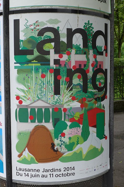
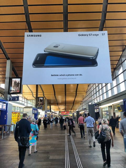
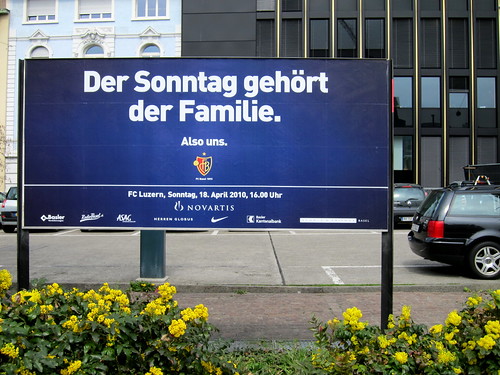
Consider a poster ad along the side of a road. You are travelling on that road on a motorbike at about 50 km/h, with your mind full of your own tasks, thoughts, ideas, emotions.
You pass the poster ad.
The question is: What will you be able to grasp “in one glance” from that poster ad while driving past?
Digital ads flow past you as you travel from web page to page.
Minimum requirements:
- Easy-to-read
- Clear message
- Able to grasp message in 1 glance (or, increase curiosity, so that they look again)
- Shorter is better
Developing Future Sales pipeline:
I want display ads to be memorable.
In B2B advertising, 95% of the time our potential clients are not in market. However, when those 5% come, I want to be “top of mind”.
Your tips? Any learnings to share with me?
(All photos are snapshots of posters that I noticed while cycling or walking or travelling. IMHO, you can learn a ton by observing. At my day job, I don’t do physical ads. I prepare digital ads for B2B.)


Leave a Reply